


The problem
SITCIN helps countries assess road, rail and inland waterway connectivity against a UN indicator framework. UNECE has since incorporated additional indicators on topics including climate and pandemic resilience. The learning challenge was to explain what to measure; the platform challenge was to help officials collect, review and submit those answers reliably.
The first brief focused on the public pages. An audit revealed structural issues inside the application: hard-coded indicators, unreliable administration, screens that failed and little documentation. National officials could not yet complete an assessment from start to finish using the platform.
The project therefore had two connected tasks: make the methodology understandable, and make the assessment workflow usable.
Who I was designing for
The main users are National Focal Points: transport and planning officials in a ministry, nominated to lead their country's assessment. They often work in English as a second or third language, and many of the colleagues they depend on in customs, rail or environment agencies do not work in English at all. They collect answers from several institutions over weeks, usually in a spreadsheet first, and come back to the platform in short sessions. Some delegate indicators to Institutional Focal Points in other agencies; others prefer to answer everything themselves.
The second group is the small UNECE team in Geneva who set up each round, support the countries and publish the results. They are policy experts, not Drupal administrators.
The pain points came from three places: UNECE's own review of the old site, my audit of the platform, and later, real officials using it. The ones that shaped the design were:
- The public site explained the methodology but not what a country gets out of taking part, or how to start.
- Status labels and buttons used different words for the same thing, so focal points could not tell where an indicator stood.
- Work could disappear. Answers did not save unless a particular account existed, and focal points who filled in a few indicators a day lost what they had typed.
- Officials who already had their answers in Excel were asked to retype hundreds of them.
- Nobody could tell a first-time user what the Institutional Focal Point role was for, or whether they needed one.
How I approached it: three stages
Stage 1. Redesign the public face and stabilise what was there (January to July 2025)
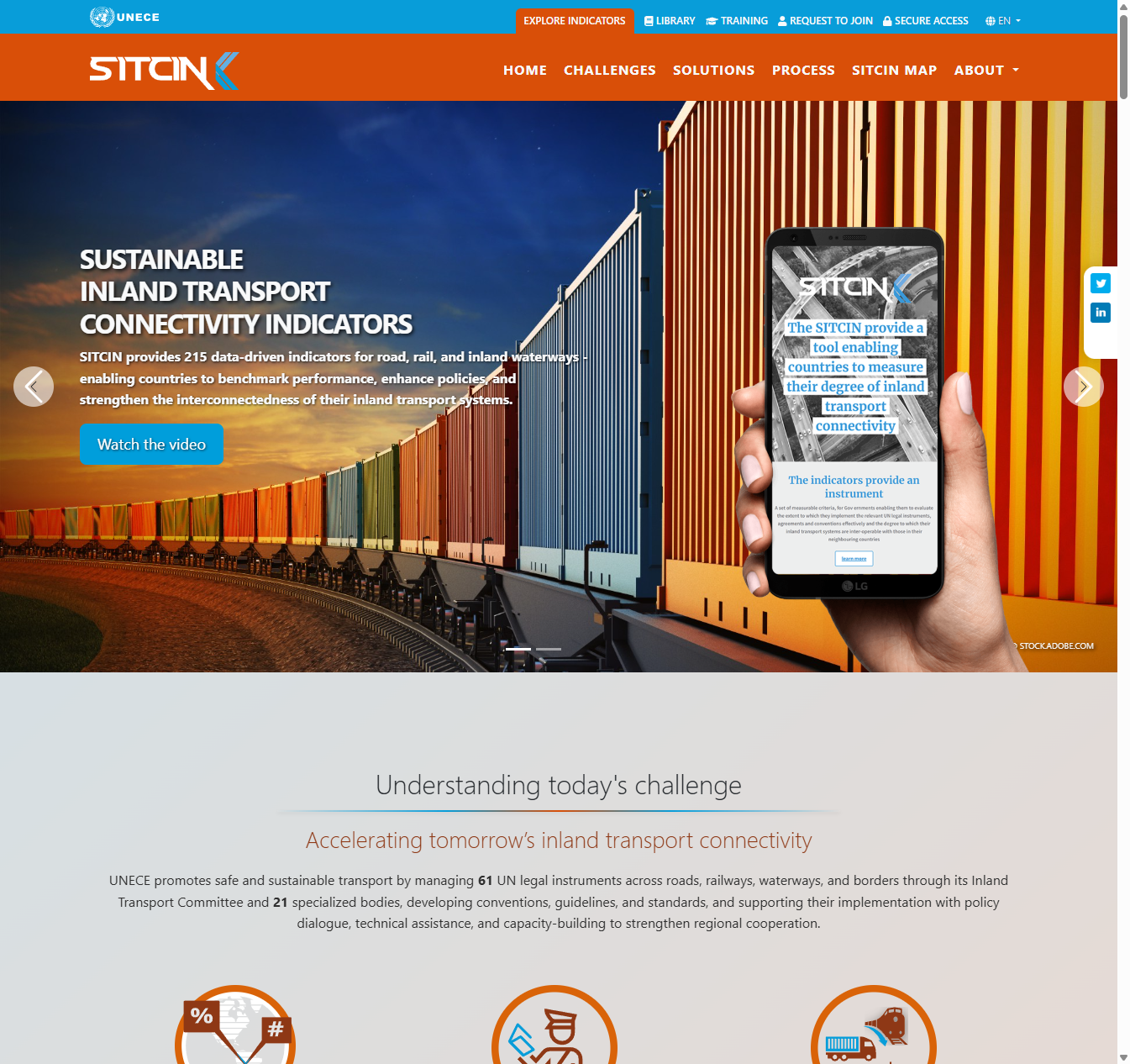
UNECE's starting brief, after our first call in October 2024, was visual: more contrast, one warm accent colour, bigger and more consistent type, stronger photography, and the assessment dashboard higher on the home page. I took that on, but I wrote the page for one reader: a senior official deciding whether their ministry should take part.
The public redesign began with the needs of a ministry official deciding whether to participate. I reorganised the page around the problems SITCIN helps investigate, the steps of an assessment and a chance to try the system, then prototyped it outside Drupal for review.
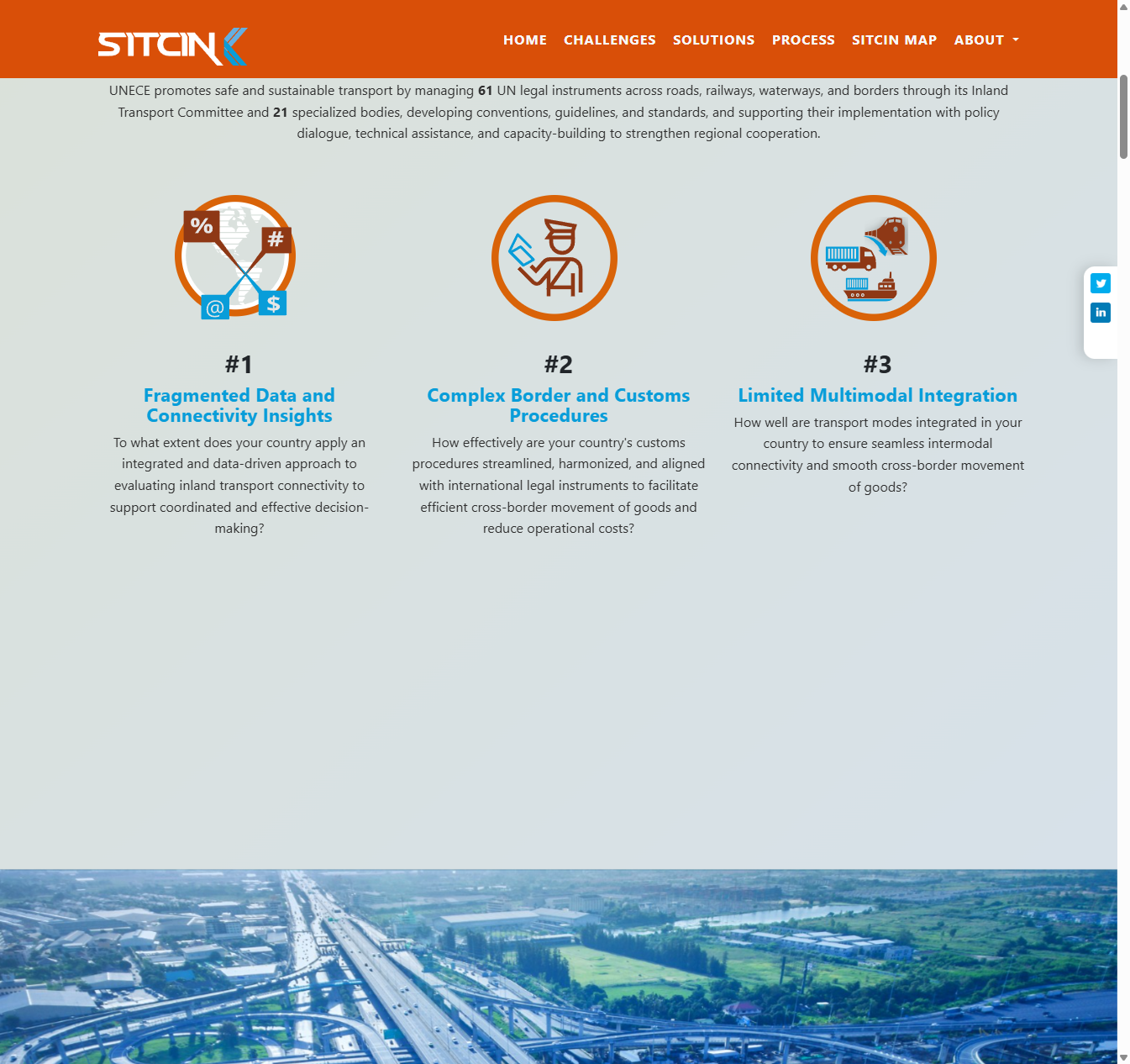
- Lead with the country's problems, not the method. The page opens with three challenges a ministry will recognise: fragmented connectivity data, complex border and customs procedures, and weak links between transport modes. Each is framed as a question the country can ask itself.
- Show the route in. A clear five-step path, from expressing interest to receiving the National Connectivity Report, so an official can see the whole commitment before signing up.
- Make it concrete. Summaries of the pilot countries' findings, and a public demo where anyone can try real indicators and see how scoring works, without an account.
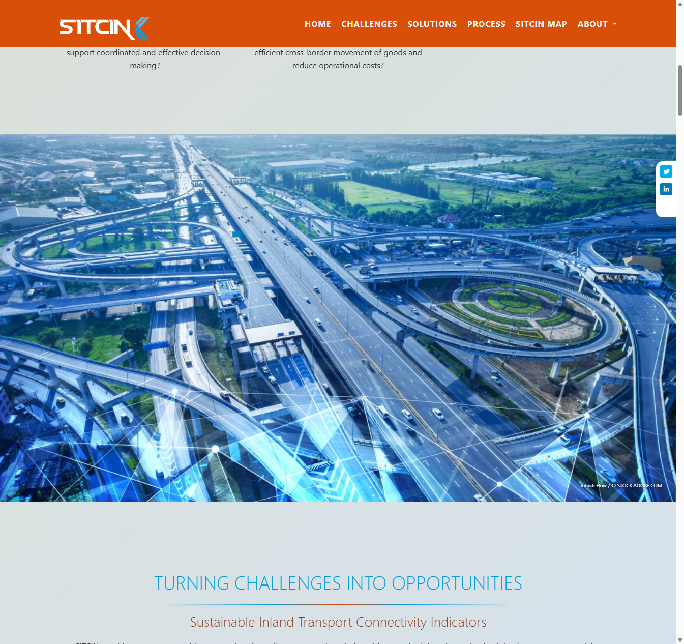
- One visual system. A rusty orange accent, three type sizes across the whole site, one photo treatment, and separate imagery for road, rail and inland waterways.
- Three languages from the start. The public site in English, French and Russian, with the French matched to UNECE's official translation of the methodology so officials meet the terms they already know.
I built the design as a working prototype outside Drupal first. That let UNECE review the look and the wording separately, and settle how to present new climate and pandemic resilience indicators, before anything was fixed in code. The project lead's verdict on the reviewed landing page and dashboard in October 2025 was "Congratulations on a job well done."
At the same time I audited the platform, got a working copy running, upgraded it to a current version of Drupal, and repaired the pages, templates and file uploads that blocked focal points from submitting anything. By the end of Stage 1 the platform worked within its limits. The audit also showed how tight those limits were.
Stage 2. Rebuild the assessment workflow, pilot with countries and launch (August 2025 to September 2026)
In July 2025 I told UNECE plainly that the redesign had turned into an overhaul. The indicator structure was hard-wired, so new indicators or countries could not be added through the admin screens, and even a new country quietly copied an old country's profile. Patching would not fix that. I set out the options in writing and UNECE's IT team chose to stay fully within standard Drupal, which they can maintain themselves.
I then rebuilt the core so UNECE staff can manage indicators, countries, users and assessments themselves. That is what let the platform incorporate the additional indicators. I also redesigned the focal point workspace around how officials actually work:
- A progress snapshot at the top, and indicators grouped under tabs by transport mode.
- Each indicator as a card: pick the score, expand the details to add the answer, source and files, then choose an action.
- One set of words for statuses, buttons and filters, so "sent", "answered" and "returned" mean the same thing everywhere.
- A Save progress button that keeps a draft without moving the indicator on, so nobody loses a day's work. The status only changes when the user chooses an action.
- Validation messages next to the card that needs attention, and short instructions on each card in plain words.
- Fewer steps for Institutional Focal Points: they receive the full indicator and can answer it or send it back, with no extra accept step.
In March 2026 three countries, Tajikistan, Azerbaijan and Kyrgyzstan, began entering real data. Within days they hit problems no review had found. Answers vanished unless an Institutional Focal Point account existed. Two accounts for the same country overwrote each other. Adding a second Institutional Focal Point silently took indicators away from the first.
The next stage of work had been planned as a technical upgrade. I recommended fixing the application first and leaving the final upgrade until just before handover, because upgrading a platform that loses data only makes the problems harder to trace. UNECE agreed. Within about two weeks the platform allowed one National Focal Point per country, let focal points answer directly without delegating, and moved only the indicators someone chose to reassign. I restored the lost data.
The pilot also changed the process. The officials already had their answers in spreadsheets, gathered from several ministries, and retyping hundreds of them was slow and error-prone. I proposed importing their Excel files so the focal points only had to check and submit. All three countries went through the full cycle, from first answer to submitted assessment, with charts and the report download working.
I handed the platform to UNECE's IT team, worked with them through the deployment on their own servers, and SITCIN went live on sitcin.org on 10 June 2026. Over the summer I fixed what early live use turned up, including tightening what focal point accounts could reach.
Stage 3. Plan the admin overhaul (from September 2026)
By August 2026 it was clear that the remaining faults were not quick fixes. They came from a specification written years earlier for a different indicator set and a different context. I said so, and UNECE agreed that patching one issue at a time could not go on. They asked for a clear plan.
I brought everything together in one document: 37 numbered items, each with its cause, a proposed solution and a plain statement of what "done" means, ordered in five steps so that nothing is built on an unverified base and nothing is fixed twice. It also lists eleven decisions only UNECE can make, such as who decides what gets published and whether a country's "not applicable" answers are reviewed. Those answers become the specification for the next phase.
How an assessment moves through the platform
Under all of this sits a simple three-stage workflow, and much of my work was making each stage reliable and obvious to the people in it.
- Opened. UNECE sets up the country's assessment and opens it. The National Focal Point completes the country profile and starts on the indicators.
- Answered. The National Focal Point answers each indicator, or sends some to Institutional Focal Points, who answer them or send them back. When everything is in, the National Focal Point submits the results.
- Closed. UNECE reviews the submission and closes it. The platform then produces the scores, charts and National Connectivity Report.
Before my work, a country could not reliably get from the first stage to the last. Now it can, and the people in each stage can see where every indicator stands.
Fixing the inherited app
The inherited application had structural faults: indicator values embedded in code, admin screens that did not perform the actions they advertised, a fragile assessment form and no reliable operating guide. I first established a working copy and a test process, then addressed the failures blocking genuine country assessments.
The order mattered: audit, stop data loss, repair administration, test the full workflow with real users, deploy through UNECE IT and document every change. A cosmetic redesign could never have delivered those results.
Writing the guides nobody had written
The platform came with no admin guide and no instructions for the officials using it. In July 2025 UNECE asked the original builder for documentation of the main admin role, and nothing new came back. So the knowledge of how to run SITCIN lived in the code and, increasingly, in my head. A UN platform that only one contractor can operate is not really handed over, so I wrote the documentation myself.
It grew in step with the project:
- Testing checklists (late 2025 and early 2026). Before UNECE staff ever ran the platform, I wrote step-by-step acceptance checklists for the admin role in plain language, so non-technical reviewers could test each function and, in doing so, learn how to use it.
- First admin guides (March 2026). As the pilot started I wrote a short onboarding guide for setting up a country and its National Focal Point, a plain-language administrator's guide, and a screen-by-screen reference to the admin area. Version 3 of the full operational guide followed the same month, and version 4 in April added a step-by-step section for National Focal Points.
- Workflow walkthroughs. Annotated slide decks showing how an indicator moves between National and Institutional Focal Points, which I used to agree the new workflow and screen changes with UNECE and the development work.
- The complete guide (May to July 2026). Version 6.0 arrived with the handover in May 2026 and was revised through version 7.8 by the end of July, roughly 18,000 words.
The final guide is written for four audiences, each with its own self-contained part:
- UNECE staff running assessment rounds: how to set up a year's round, register a country and its focal point, open and close the round, and publish the results, with a checklist to run before handing an account to a country.
- National Focal Points: logging in, reading the dashboard and indicator cards, answering or delegating indicators, reviewing what comes back, and submitting the country's results.
- Institutional Focal Points: a shorter guide to answering or returning the indicators assigned to them.
- UNECE IT: how to deploy, update and roll back the platform on their own servers, plus a reference for any future developer.
I wrote the focal point parts so that UNECE can send each one to a country on its own, or paste a single section into an email. Officials working in a second language should never have to read about roles that are not theirs.
The guides did real work during the pilot and handover. Each pilot fix changed how a screen behaved, and the guide changed with it, so the instructions countries received always matched what they saw. When a new country's setup failed because a hidden section of a form had been missed, the answer went into the guide as a pre-onboarding check. When the summer fixes introduced draft saving and removed the Institutional Focal Point's accept step, the next versions explained the new behaviour. I kept a fuller internal version, with known issues, for the project team, and gave UNECE a clean client-facing version. By September 2026 the guide had become the yardstick for what was left to do: my remaining-issues plan marks each item against what the guide already says the platform should do.
The result
- The public site now explains why a country might participate and how the process works, in English, French and Russian.
- UNECE can administer countries, indicators and users, with additional indicators incorporated.
- National and Institutional Focal Points have clearer workflows and role-specific guidance.
- The updated platform has been live on UNECE infrastructure since 10 June 2026.
- Three pilot countries completed the assessment cycle and produced results and reports.
- Live on sitcin.org since 10 June 2026, on UNECE's own servers, maintained by UNECE IT.
In September 2026, the UNECE project lead acknowledged that I had inherited a platform that was incomplete and based on requirements several years old.
What's next
UNECE's goal for the next phase is a platform that serves them for years with only routine maintenance. The plan starts with no new development at all: settle the eleven decisions, then confirm the platform is secure and that its scores match the published methodology. After that come protecting the data, making the code safe to change, and everyday usability. The last, optional step is to use the data the platform already holds, for example cross-country comparison and reports generated on demand, without building more inside Drupal.
What I took from it
- When a visual redesign exposes a structural problem, present the options and get an explicit decision on scope.
- Prototype a real experience early, in the language and context of the intended users.
- Test real tasks with real data. The pilot countries exposed issues that document reviews had not found.
- Design around the users' actual work, including spreadsheets, delegation between agencies and short sessions.
- Treat documentation as part of the learning experience and the product handover.
Working with a fragile learning or information platform? Tell me about your project